Building a Modern SaaS Dashboard with Saas UI and Next.js App Router
Dashboards are essential for every SaaS app, and UI libraries do help you build them fast. Let's look at how Saas UI can help.
Posted by

Eelco Wiersma
@eelcodotdev

Introduction
The global SaaS or Software as a Service market size is increasing at an incredible pace. In 2022, the market size was valued at USD 237.48 billion. And it is expected to grow to USD 908.21 billion by 2030.
For aspiring indie developers venturing into the realm of SaaS - regardless of your business niche - is the user-facing dashboard. This dashboard functions as a centralized nexus, orchestrating the monitoring, analysis, and visualization of data stemming from your application. There's just no substitute for a good administrative dashboard.
Building an efficient, responsive, and good-looking dashboard can take significant time. However, if you'd rather prioritize channeling your energy into product refinement rather than exhaustive UI/UX design, Saas UI can be a great addition to your UI kit for building smooth and beautiful dashboards. Saas UI provides a comprehensive set of design components, and combining it with a Next.js 14 application serves as a powerful foundation for any SaaS application.
Saas UI: The React component library for Startups
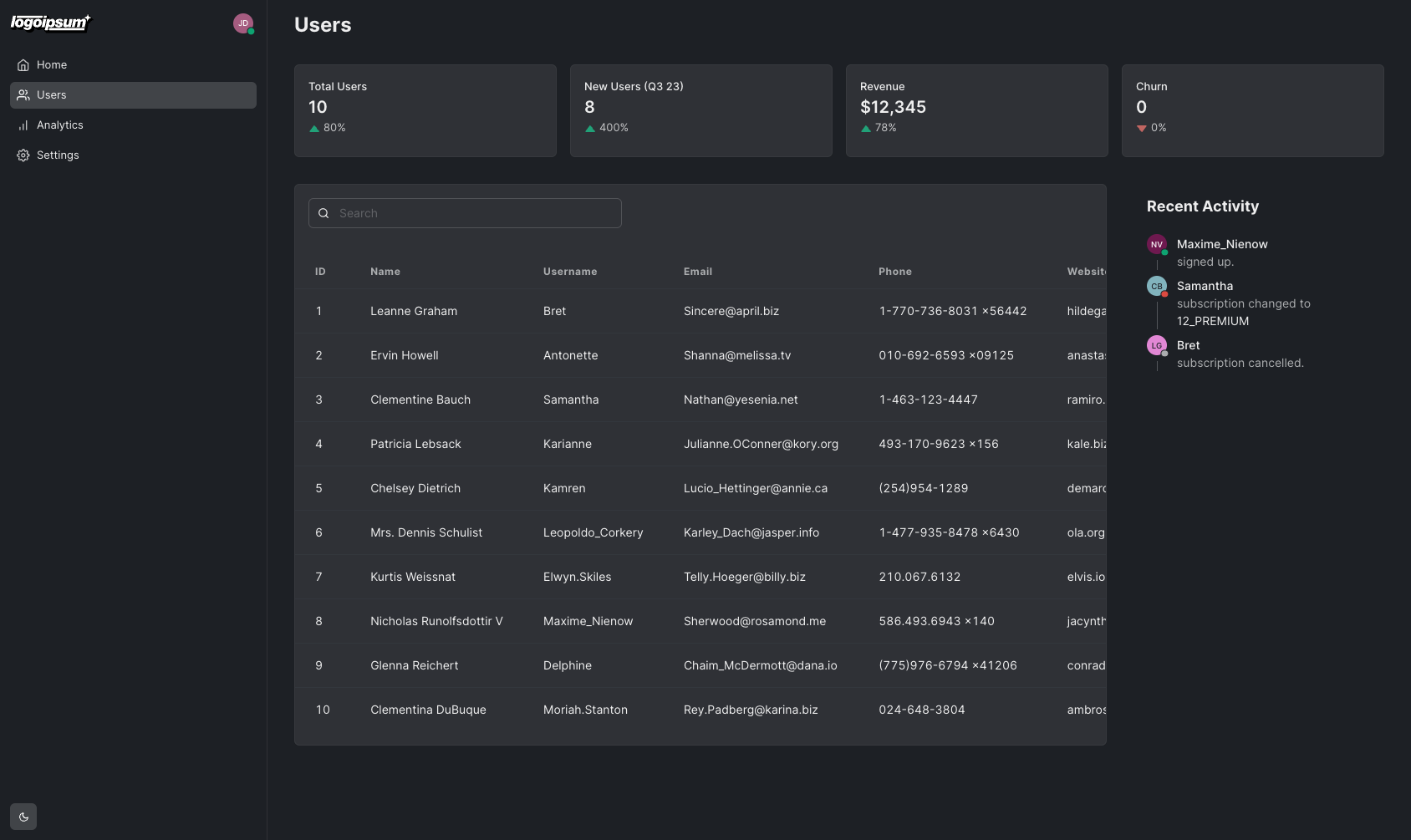
The objective of this article is to guide you through the process of building a modern dashboard for a SaaS app using Saas UI and the Next.js app router.
Let's get started!
Building a Modern Dashboard App with Saas UI and Next.js App Router
Saas UI is a React component library and a starter kit that helps you build intuitive SaaS products with speed. It provides accessible, themeable, and composable UI elements that look and feel great. It is based on Chakra and includes 40 essential elements that are open-sourced.
On the other hand, Next.js is a React framework that allows you to create full-stack web applications by extending the latest React features. It offers a powerful combination of server-side rendering, efficient client-side navigation, and a robust development ecosystem. The latest iteration - NextJS 14 - provides intuitive layouts and routing, improved SEO, and additional features like built-in font, image, script optimization, and, critically, React server components...with one cat
Combining the two can help you build high-performance, responsive, data-dense dashboards with speed.
Let's begin by creating a Next.js project and setting it up.
Setting Up the Next.js Project
Scaffolding a new Next.js application using the Next.js CLI is very simple.
npx create-next-app@latestRunning the command will ask you a few questions about the project setup. To keep this tutorial straightforward, Typescript will not be used. Since Saas UI is built on top of Chakra UI, we also don't need Tailwind CSS. You can use the following options to set up the project:
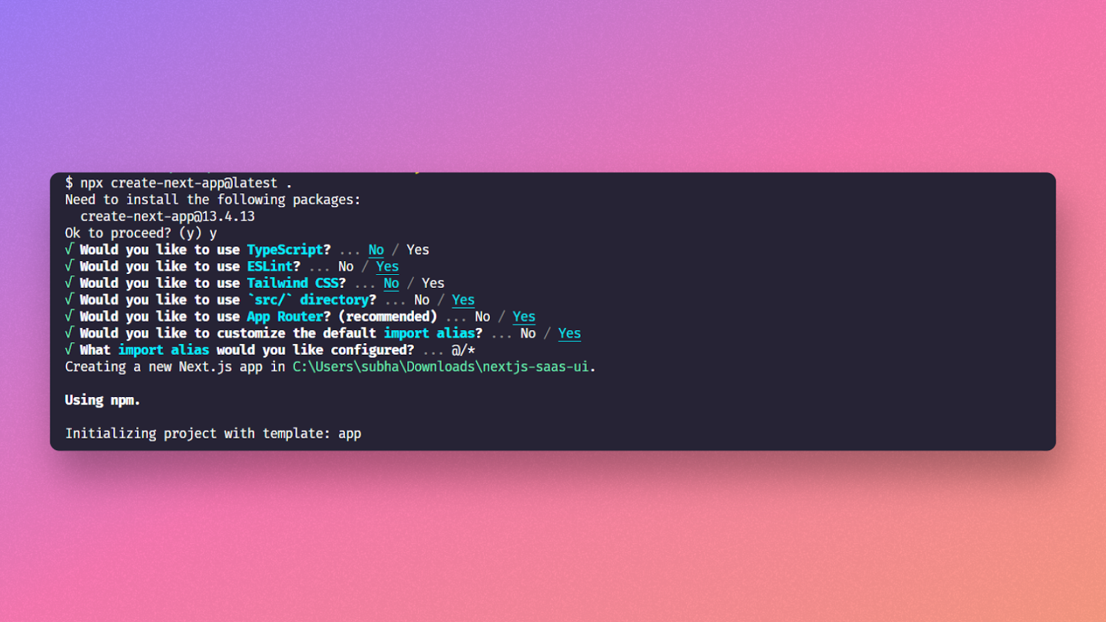
Once the required packages install successfully, you are ready to install the Saas UI. Installing Saas UI is straightforward. Let's set up the Next.js application using Saas UI.
Installing Saas UI
First, run the following command in your terminal to install the required packages:
npx @saas-ui/cli@rc initHere's a brief explanation of these packages:
@saas-ui/cli: installs the preset and user-owned Saas UI templates.@chakra-ui/react: The Chakra UI package for React. Saas UI is built on top of Chakra UI, so it needs it as a dependency.@chakra-ui/next-js: Chakra UI package for smoother integration with Next.js's app router. It gives us the<CacheProvider>that we'll need to ensure Chakra's computed styles play nice with Next.js's Streaming SSR.@emotion/react: For CSS-in-JS. It is a Chakra UI dependency.@emotion/styled: The styled API for@emotion/react.framer-motion: For animations. Another ChakraUI dependency.
We also want to add some nice icons.
npm i react-iconsOnce the packages are successfully installed, create a new file called providers.jsx inside the app directory. Paste the following content in it:
'use client'

import { CacheProvider } from '@chakra-ui/next-js'
import { Provider as SaasProvider } from '#components/setup/provider/provider'

export function Providers({ children }) {
  return (
    <CacheProvider>
      <SaasProvider>{children}</SaasProvider>
    </CacheProvider>
  )
}
The SaasProvider adds the Saas UI theme to your application. It also provides
the ChakraProvider and ColorModeProvider from Chakra UI.
Chakra UI (and by extension, Saas UI) make extensive use of React context, and
thus are client components. To make your life easier, all components are
annotated with 'use client' directives, so they can simply be used in your
server components.
The @chakra-ui/next-js package provides the CacheProvider for smoother
integration into the Next.js app router setup - composing
Emotion's cache provider with
Next.js's new
useServerInsertedHTML hook
to make sure Chakra UI generated styles are included in the initial server
payload for Streaming SSR.
So, import this providers.jsx file into your root component - the layout.js
file. The layout.js file inside the src directory works as a top-level
layout for your entire application.
At this point, remove everything from the layout.js file and paste the
following content to it:
import { Providers } from './providers'

export default function RootLayout({ children }) {
  return (
    <html lang="en">
      <body>
        <Providers>{children}</Providers>
      </body>
    </html>
  )
}
The code here is simple. Only the Providers component we built before is imported, and it wraps all children components, allowing you to use the Saas UI components throughout your application.
The initial setup for Saas UI is now complete. Now, let's explore the different parts of our dashboard design and see how we can implement them using Saas UI components.
Designing a Dashboard
We're sticking to only the Users administrative section for our Dashboard design. We will have four components, essentially.
- A sidebar, for navigation.
- A summary section to provide KPI numbers to admin users at a glance
- A recent activity section to show new signups, plan changes, cancellations, etc.
- A list of users. This will be the main component of this page.
Let's make our way down this list.
1. The Sidebar
Sidebars are usually the most common type of navigation. It can take quite some time if you want to create it from scratch, but Saas UI makes it super easy. It provides a component called AppShell. AppShell offers a collection of components that can be shared throughout the application, consisting of a header, content aside, footer - and you guessed it, a Sidebar.
Create a new folder called components inside your src directory and create a
file called SidebarLayout.jsx inside it. Once the file is created, paste the
following code inside it:
import { Box, Spacer } from '@chakra-ui/react'
import { IconButton } from '#components/ui/icon-button'
import { AppShell } from '#components/ui/app-shell'
import { Menu } from '#components/ui/menu'
import { Persona } from '#components/ui/persona/persona-composed'
import { Sidebar } from '#components/ui/sidebar'
import Image from 'next/image'
import Logo from 'public/logoipsum-288.svg'
import { FiBarChart, FiHome, FiSettings, FiSidebar, FiUsers } from 'react-icons/fi'

export function SidebarLayout({ children }) {
  return (
    <AppShell
      height="$100vh"
      fontSize="md"
      sidebar={
        <Sidebar.Provider>
          <Sidebar.Root width="25%" bg="gray.100">
            <Sidebar.Header>
              <Sidebar.Trigger asChild>
                <IconButton aria-label="Toggle sidebar" variant="ghost">
                  <FiSidebar />
                </IconButton>
              </Sidebar.Trigger>
            <Image src={Logo} width="100" alt="Logo" />
            <Spacer />
            <Menu.Root>
              <Menu.Trigger asChild>
                <IconButton aria-label="User menu" variant="ghost">
                  <Persona.Root presence="online">
                    <Persona.Avatar size="xs" name="John Doe" />
                  </Persona.Root>
                </IconButton>
              </Menu.Trigger>
              <Menu.Content>
                <Menu.Item value="sign-out">Sign out</Menu.Item>
              </Menu.Content>
            </Menu.Root>
            </Sidebar.Header>
          <Sidebar.Body flex="1" overflowY="auto">
            <Sidebar.Group>
              <Sidebar.GroupContent>
                <Sidebar.NavItem>
                  <Sidebar.NavButton><FiHome /> Home</Sidebar.NavButton>
                </Sidebar.NavItem>
                <Sidebar.NavItem>
                  <Sidebar.NavButton active><FiUsers /> Users</Sidebar.NavButton>
                </Sidebar.NavItem>
                <Sidebar.NavItem>
                  <Sidebar.NavButton><FiBarChart /> Analytics</Sidebar.NavButton>
                </Sidebar.NavItem>
                <Sidebar.NavItem>
                  <Sidebar.NavButton><FiSettings /> Settings</Sidebar.NavButton>
                </Sidebar.NavItem>
              </Sidebar.GroupContent>
            </Sidebar.Group>
          </Sidebar.Body>
          </Sidebar.Root>
        </Sidebar.Provider>
      }
    >
      <Box as="main" overflow="auto" py="6" px="8" fontSize="md">
        {children}
      </Box>
    </AppShell>
  )
}
⚠️ As you can see, we didn't add the 'use client' directive, since this is
already added by Chakra and Saas UI internally, you can safely use the
components in your server components.
The Logo is a placeholder SVG logo for demonstration purposes. You can download it from here if you want to use the same.

Let's quickly go over this code.
- The AppShell component accepts a sidebar prop. This prop is used to pass JSX for displaying a sidebar, as a component.
- The installed Sidebar template exposes
Sidebar.Header,Sidebar.Body, andSidebar.Footerparts for the logo, account menu, navigation, and color mode action. Sidebar.Triggertoggles the Sidebar on mobile and tablet devices.- Navigation entries compose
Sidebar.NavItemandSidebar.NavButton. The children prop is provided inside the Box component to display the child elements. - The installed
Persona.Avatarcomponent displays the user's profile image. You can provide a src prop to it containing an image URL, and it'll display the image. If you don't want to display the image, pass another prop called name with the user's name. In this case, it's John Doe, and it will display the initial of the name inside it. You can also provide a presence prop that can either be online, offline, busy, dnd, or away. You can see more in the docs. - For an accessible dropdown menu that is Tab navigable, the installed
Menucomposition exposesMenu.Trigger,Menu.Content, andMenu.Item. Check docs here for a better understanding of their functionalities.
There's one last thing to add and that is a color mode switch, so users can
switch between light and dark mode. We can use the useColorMode hook from
Chakra UI to do this. Add the following code to the SidebarLayout.jsx file:
'use client'

import { Box, Spacer } from '@chakra-ui/react'
import { IconButton } from '#components/ui/icon-button'
import { useColorMode } from '#components/setup/color-mode/color-mode'
import { AppShell } from '#components/ui/app-shell'
import { Menu } from '#components/ui/menu'
import { Persona } from '#components/ui/persona/persona-composed'
import { Sidebar } from '#components/ui/sidebar'
import Image from 'next/image'
import Logo from 'public/logoipsum-288.svg'
import {
  FiBarChart,
  FiHome,
  FiMoon,
  FiSettings,
  FiSidebar,
  FiSun,
  FiUsers,
} from 'react-icons/fi'

export function SidebarLayout({ children }) {
  const { colorMode, toggleColorMode } = useColorMode()

  return (
    <AppShell
      height="$100vh"
      fontSize="md"
      sidebar={
        <Sidebar.Provider>
          <Sidebar.Root width="25%" bg="gray.100">
            <Sidebar.Header>
              <Sidebar.Trigger asChild>
                <IconButton aria-label="Toggle sidebar" variant="ghost">
                  <FiSidebar />
                </IconButton>
              </Sidebar.Trigger>
            <Image src={Logo} width="100" alt="Logo" />
            <Spacer />
            <Menu.Root>
              <Menu.Trigger asChild>
                <IconButton aria-label="User menu" variant="ghost">
                  <Persona.Root presence="online">
                    <Persona.Avatar size="xs" name="John Doe" />
                  </Persona.Root>
                </IconButton>
              </Menu.Trigger>
              <Menu.Content>
                <Menu.Item value="sign-out">Sign out</Menu.Item>
              </Menu.Content>
            </Menu.Root>
            </Sidebar.Header>
          <Sidebar.Body flex="1" overflowY="auto">
            <Sidebar.Group>
              <Sidebar.GroupContent>
                <Sidebar.NavItem>
                  <Sidebar.NavButton><FiHome /> Home</Sidebar.NavButton>
                </Sidebar.NavItem>
                <Sidebar.NavItem>
                  <Sidebar.NavButton active><FiUsers /> Users</Sidebar.NavButton>
                </Sidebar.NavItem>
                <Sidebar.NavItem>
                  <Sidebar.NavButton><FiBarChart /> Analytics</Sidebar.NavButton>
                </Sidebar.NavItem>
                <Sidebar.NavItem>
                  <Sidebar.NavButton><FiSettings /> Settings</Sidebar.NavButton>
                </Sidebar.NavItem>
              </Sidebar.GroupContent>
            </Sidebar.Group>
          </Sidebar.Body>
          <Sidebar.Footer alignItems="flex-start">
            <IconButton
              aria-label="Toggle color mode"
              onClick={toggleColorMode}
            >
              {colorMode === 'dark' ? <FiMoon /> : <FiSun />}
            </IconButton>
          </Sidebar.Footer>
          </Sidebar.Root>
        </Sidebar.Provider>
      }
    >
      <Box as="main" overflow="auto" py="6" px="8" fontSize="md">
        {children}
      </Box>
    </AppShell>
  )
}
Note that since we are using a hook here, we have to turns this into a client
component by adding the 'use client' directive.
Now, open the layout.js file again and add the new SidebarLayout:
import SidebarLayout from '@/components/SidebarLayout'

import { Providers } from './providers'

export default function RootLayout({ children }) {
  return (
    <html lang="en">
      <body>
        <Providers>
          <SidebarLayout>{children}</SidebarLayout>
        </Providers>
      </body>
    </html>
  )
}
The new SidebarLayout will now be used as the top-level layout for your application. You can now start building the dashboard components.
2. Data Table
Dashboards are built to display large amounts of data in a more readable format. A data table makes it easier. Let's implement a data table with Saas UI now. But before that, let's fetch some data to display in the data table.
You'll be using the JSON Placeholder API to fetch user data. Our parent component - page.js - is a Server Component by default. Being natively stateless and async, we can make the fetch API call directly here!
Use the built-in fetch method to fetch the data. Change the code of this file according to the following code sample:
export default async function Home() {
  const COLUMNS = [
    {
      accessorKey: 'id',
      header: 'ID',
    },
    {
      accessorKey: 'name',
      header: 'Name',
    },
    {
      accessorKey: 'username',
      header: 'Username',
    },
    {
      accessorKey: 'email',
      header: 'Email',
    },
    {
      accessorKey: 'phone',
      header: 'Phone',
    },
    {
      accessorKey: 'website',
      header: 'Website',
    },
  ]

  const users = await fetch('https://jsonplaceholder.typicode.com/users').then(
    (res) => res.json(),
  )

  console.log(users)

  return <div />
}
At this moment, you are only fetching the data from the JSON Placeholder and converting it to a JSON object. The data table in Saas UI uses TanStack Table under the hood and usually takes two props - one for the table columns and the other one for data.
The columns are hard-coded in this case, but they can be easily made dynamic using some JavaScript magic. The accessorKey represents the identifier of the key, and the header is the text that you want to show for the key.
The data is returned and stored in the users variable. Running your app will display the contents in your server console. Once the data fetching is done, let's create the data table component for displaying it.
Create a new file inside the components directory and name it DataTable.jsx. Paste the below code into it:
'use client'

import { Card } from '@chakra-ui/react'
import { DataGrid } from '@saas-ui-pro/react'

export function DataTable({ columns, data }) {
  return (
    <Card.Root>
      <Card.Body overflowX="auto" px="0">
        <DataGrid columns={columns} data={data} />
      </Card.Body>
    </Card.Root>
  )
}
The DataTable component is built using the Pro DataGrid component installed in the project. The component takes two props. One is for the columns, and the other is for the data. These props are passed into the columns and data props of the DataTable component.
Change the body of the page like this:
import { DataTable } from '@/components/DataTable'
import { Box } from '@chakra-ui/react'

export default async function Home() {
  const COLUMNS = [
    {
      accessorKey: 'id',
      header: 'ID',
    },
    // ...
  ]

  // ...

  return (
    <Box overflowX="auto">
      <Heading as="h2">Users</Heading>

      <DataTable columns={COLUMNS} data={users} />
    </Box>
  )
}
The DataTable component accepts props like isSortable, isSelectable, etc. Passing these props into the component will allow you to either sort or select the data from the table. This component is now ready. You can also add a search box at the top of the datable using the SearchInput component from the Saas UI package. Importing and using it is pretty straightforward. Inside the parent Box component of the DatatableComponent, paste the following code:
import { Card } from '@chakra-ui/react'
import { SearchInput } from '#components/ui/search-input'
import { DataGrid } from '@saas-ui-pro/react'

export function DataTable({ columns, data }) {
  return (
    <Card.Root>
      <Card.Header>
        <SearchInput width="40%" placeholder="Search" />
      </Card.Header>
      <Card.Body overflowX="auto" px="0">
        <DataGrid columns={columns} data={data} />
      </Card.Body>
    </Card.Root>
  )
}
It'll display the search box, take 40% width of the parent, and add a margin-bottom of 3 rem. You can bind it with your search API to make it functional.
For the sake of this example we will connect the search box to the data table and use client side filtering.
First we'll need to install React Table, since filtering is not enabled by default in the DataTable.
npm i @tanstack/react-tableNow change the DataTable.jsx file to the following:
'use client'

import React from 'react'

import { Card } from '@chakra-ui/react'
import { SearchInput } from '#components/ui/search-input'
import { DataGrid } from '@saas-ui-pro/react'
import { getFilteredRowModel } from '@tanstack/react-table'

export function DataTable({ columns, data }) {
  const [globalFilter, setGlobalFilter] = React.useState('')

  return (
    <Card.Root>
      <Card.Header>
        <SearchInput
          width="40%"
          placeholder="Search"
          value={globalFilter}
          onChange={(e) => setGlobalFilter(e.target.value)}
          onReset={() => setGlobalFilter('')}
        />
      </Card.Header>
      <Card.Body overflowX="auto" px="0">
        <DataGrid
          columns={columns}
          data={data}
          getFilteredRowModel={getFilteredRowModel()}
          state={{ globalFilter }}
          onGlobalFilterChange={setGlobalFilter}
        />
      </Card.Body>
    </Card.Root>
  )
}
Note that we added the 'use client' here, this is because we're using
React.useState which is a client side hook.
That's it! Now you can search through the data table, it will do a fuzzy search on all columns.
3. Summary Display
This is our simplest component. It exists just to display relevant company metrics in a high-visibility way, aiming to be the first thing the administrative user sees upon entering this section of the Dashboard.

Create a new file called Summary.jsx inside the components folder and paste the following code into it:
import { Box, Card, Grid, GridItem } from '@chakra-ui/react'
import { Stat } from '#components/ui/stat'

export function Summary({ currentUsersCount, oldUsersCount }) {
  return (
    <Box mb="8" w="full">
      <Grid
        templateColumns={{ base: 'repeat(2, 1fr)', lg: 'repeat(4, 1fr)' }}
        gap="4"
        width="full"
      >
        <GridItem>
          <Card.Root><Card.Body><Stat.Root>
            <Stat.Label>Total Users</Stat.Label>
            <Stat.ValueText>{currentUsersCount}</Stat.ValueText>
            <Stat.HelpText><Stat.UpTrend>80%</Stat.UpTrend></Stat.HelpText>
          </Stat.Root></Card.Body></Card.Root>
        </GridItem>
        <GridItem>
          <Card.Root><Card.Body><Stat.Root>
            <Stat.Label>New Users (Q3 23)</Stat.Label>
            <Stat.ValueText>{currentUsersCount - oldUsersCount}</Stat.ValueText>
            <Stat.HelpText>
              <Stat.UpTrend>
                {((currentUsersCount - oldUsersCount) / oldUsersCount) * 100}%
              </Stat.UpTrend>
            </Stat.HelpText>
          </Stat.Root></Card.Body></Card.Root>
        </GridItem>
        <GridItem>
          <Card.Root><Card.Body><Stat.Root>
            <Stat.Label>Revenue</Stat.Label>
            <Stat.ValueText>$12,345</Stat.ValueText>
            <Stat.HelpText><Stat.UpTrend>78%</Stat.UpTrend></Stat.HelpText>
          </Stat.Root></Card.Body></Card.Root>
        </GridItem>
        <GridItem>
          <Card.Root><Card.Body><Stat.Root>
            <Stat.Label>Churn</Stat.Label>
            <Stat.ValueText>0</Stat.ValueText>
            <Stat.HelpText>0%</Stat.HelpText>
          </Stat.Root></Card.Body></Card.Root>
        </GridItem>
      </Grid>
    </Box>
  )
}
The data this component needs will be passed to it as props from the parent server component.
4. Recent Activity
This section uses Saas UI's Timeline component to display a list of events chronologically - user signups, plan changes, cancellations, and so on.
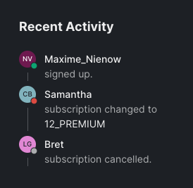
The Timeline component can display a simple list of events, or - as we're doing here - custom content.
The Chakra UI
Timeline.Connector
part lets us customize the component/icon we want to use for each item, and
we'll use the
Persona component
here, again, to represent users, as each event in our Timeline has something
to do with a user.
import { Card, Heading, Text, Timeline } from '@chakra-ui/react'
import { Persona } from '#components/ui/persona/persona-composed'

export function Recent() {
  return (
    <Card.Root variant="solid" bg="transparent">
      <Card.Header pb="0">
        <Heading as="h3" size="md">
          Recent Activity
        </Heading>
      </Card.Header>
      <Card.Body>
        <Timeline.Root variant="outline">
          <Timeline.Item>
            <Timeline.Connector>
              <Persona.Root presence="online">
                <Persona.Avatar name="Nicholas Runolfsdottir V" size="xs" />
              </Persona.Root>
            </Timeline.Connector>
            <Timeline.Content pt="2" px="3">
              <Text fontWeight="medium">Maxime_Nienow</Text>
              <Text color="muted">signed up.</Text>
            </Timeline.Content>
          </Timeline.Item>
          <Timeline.Item>
            <Timeline.Connector>
              <Persona.Root presence="dnd">
                <Persona.Avatar name="Clementine Bauch" size="xs" />
              </Persona.Root>
            </Timeline.Connector>
            <Timeline.Content pt="2" px="3">
              <Text fontWeight="medium">Samantha</Text>
              <Text color="muted">subscription changed to </Text>
              <Text>12_PREMIUM</Text>
            </Timeline.Content>
          </Timeline.Item>
          <Timeline.Item>
            <Timeline.Connector>
              <Persona.Root presence="offline">
                <Persona.Avatar name="Leanne Graham" size="xs" />
              </Persona.Root>
            </Timeline.Connector>
            <Timeline.Content pt="2" px="3">
              <Text fontWeight="medium">Bret</Text>
              <Text color="muted">subscription cancelled.</Text>
            </Timeline.Content>
          </Timeline.Item>
        </Timeline.Root>
      </Card.Body>
    </Card.Root>
  )
}
5. Putting it all together
Replace the current contents of the page.js file and paste this code:
import { DataTable } from '@/components/DataTable'
import { Recent } from '@/components/Recent'
import { Summary } from '@/components/Summary'
import { Box, Flex } from '@chakra-ui/react'

export default async function Home() {
  const COLUMNS = [
    {
      accessorKey: 'id',
      header: 'ID',
    },
    {
      accessorKey: 'name',
      header: 'Name',
    },
    {
      accessorKey: 'username',
      header: 'Username',
    },
    {
      accessorKey: 'email',
      header: 'Email',
    },
    {
      accessorKey: 'phone',
      header: 'Phone',
    },
    {
      accessorKey: 'website',
      header: 'Website',
    },
  ]

  const users = await fetch('https://jsonplaceholder.typicode.com/users').then(
    (res) => res.json(),
  )

  return (
    <Box>
      <Heading as="h2" mb="8" ms={{ base: 8, lg: 0 }}>
        Users
      </Heading>
      <Flex>
        <Summary currentUsersCount={users.length} oldUsersCount={2} />
      </Flex>
      <Flex gap="8" flexDirection={{ base: 'column', lg: 'row' }}>
        <Box flex="1" overflowX="auto">
          <DataTable columns={COLUMNS} data={users} />
        </Box>
        <Box width="30%" maxW="300px" flexShrink="0">
          <Recent />
        </Box>
      </Flex>
    </Box>
  )
}
The complete dashboard, at this moment, should look like the image below.
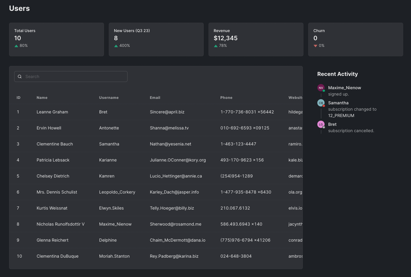
We also added responsive styles so the dashboard will look good on mobile devices.
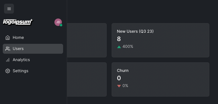
There are many other components Saas UI provides to make building SaaS applications easier. Check out the documentation to learn more. If you are not satisfied with the styling of your app, you can also change the theming. Follow this link to understand better how theming can be done in Saas UI.
The code of this article can be found in this Github repo.
Conclusion
The aim of the article was to help you get started with building a modern dashboard using the Next.js app directory setup, using Saas UI to do so. To that end, hopefully, you now have a good idea of how Saas UI can be integrated into your Next.js 14 application and how its components could be used to build responsive, accessible, and customizable SaaS apps quickly.
The official Saas UI documentation is a great place if you want to learn more about it. Layout components like Page, Aside, and Split Page are available in the public registry. Saas UI also provides a Pro license for advanced components like Data Grid and more. The pricing for the Pro license starts at €199. Check out the pricing page for more information.